Joule is a healthy foods store and catering with multiple foods packages and products
Problem.
The Joule website loses customers and users for multiple reasons: Users of this website reported multiple issues every day for example:
How can I see the food list?
Where are the packages?
How can I add food to my basket?
Where is the basket link or icon?
Both email & phone number verification is required in the registration
I don’t get an email from the website
Adding address in the registration flow
else…
Goal.
In this project, we looked for real problems to fix these issues:
Increase the customers by fixing the problems
Making happy the constant customers
Having a beautiful website like business field (Vivid colors)
In the redesign projects, I follow these steps
My Design Process.
01.
Stakeholder interview
Support team
Marketing team
Management
02.
Audiences & Needs
I specified the audience & make the focus group
03.
Research
On this project, I looked at the business requirements and the user’s expectations from this service.
04.
Data Analysis
After gaining information from the stakeholders & users, I analyzed the information to draw a road for designing the website.
05.
Wireframing
I designed wireframes and shared them with stakeholders and developers to validate my designs
06.
UI Design
After validating the wireframes, I designed the UI. In this phase, we designed the design system for the website.
Reaserch.
This research includes the user’s information and the website information base on google analytics and interviewers with stakeholders
Users info.
Personas:
High-level managers
Women who are looking for fitness
Employees that looking for healthy single meals.
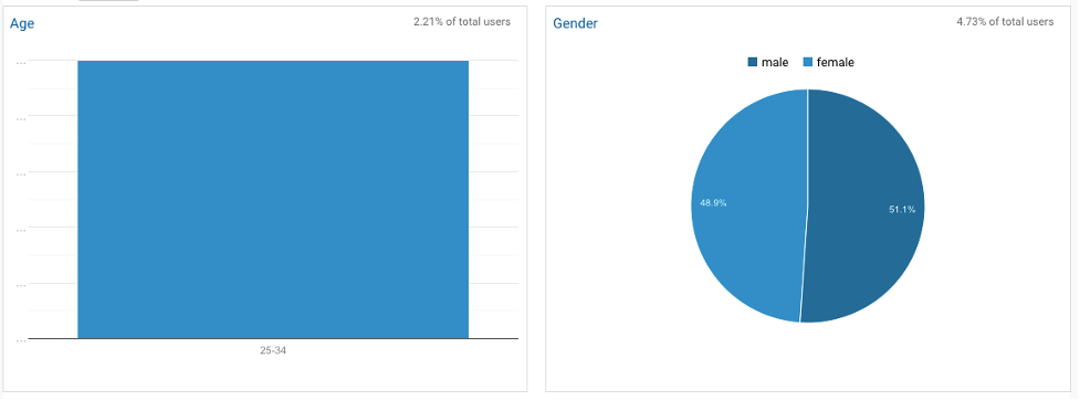
Age & Gender:
25 – 34 years old
Male: 51.1%
Female: 49.9%
How users browse our website.
Devices:
Mobile : 91.0%
Desktop: 8.3%
Tablet: 0.7%
Users behavior.
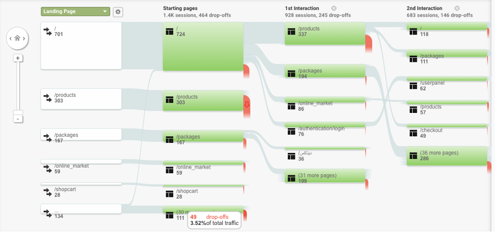
We can see some problems on this flow map:
In this flow map, in a period from 701 hits, only 49 hits reach the payment page.
On the products page, we have 100% drop-offs
This flow map shows us that we have some problems with the product page!
Old User flows.
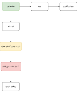
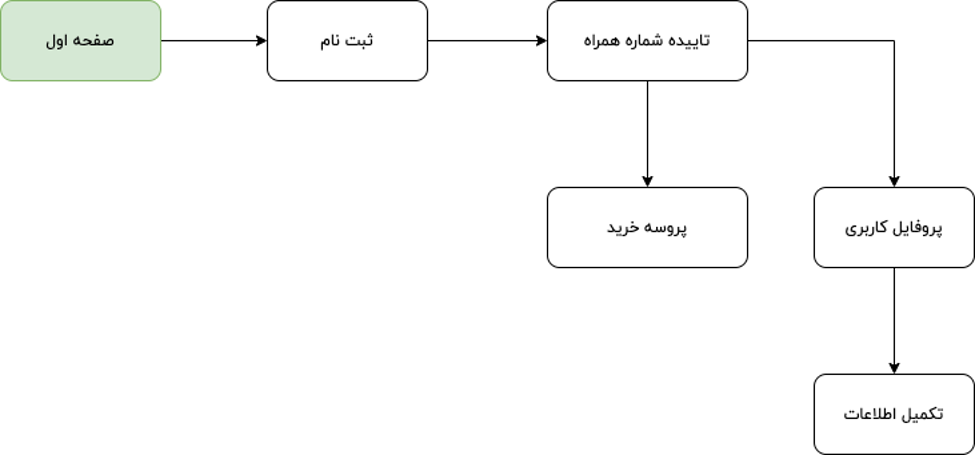
Registration flow.
On the registration flow, we had two non-necessary two steps that the user should visit.
For example, when a new user wants to order food, he/she should complete their profile. But this information is not required for an order.
The red box (Profile information) The yellow box (Email & phone verification)
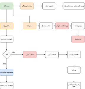
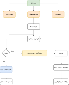
Shopping flow.
On the shopping flow, we had three ways to order multiple products.
For example, when a user wants to order food, he/she had a different flow for payment VS shopping a product (non-food products) Different payment & registration flow for different products on the same website!
Another problem in the address selection step! (users couldn’t select their address on the map)
The red box (registration info & Select address) The yellow box (different type of products)
New User flows.
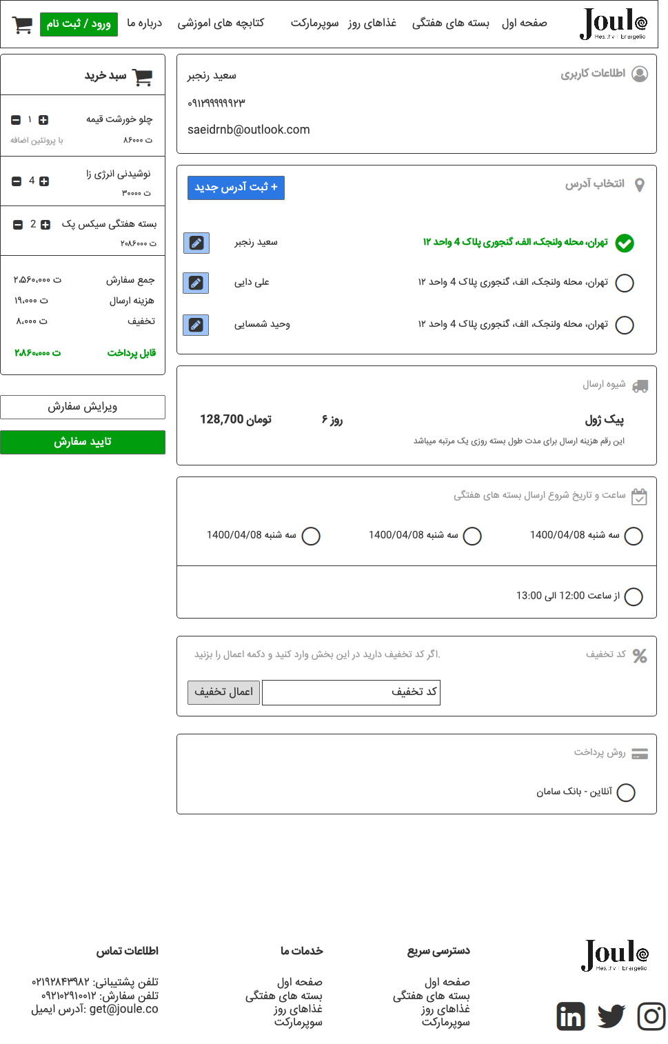
New Registration flow.
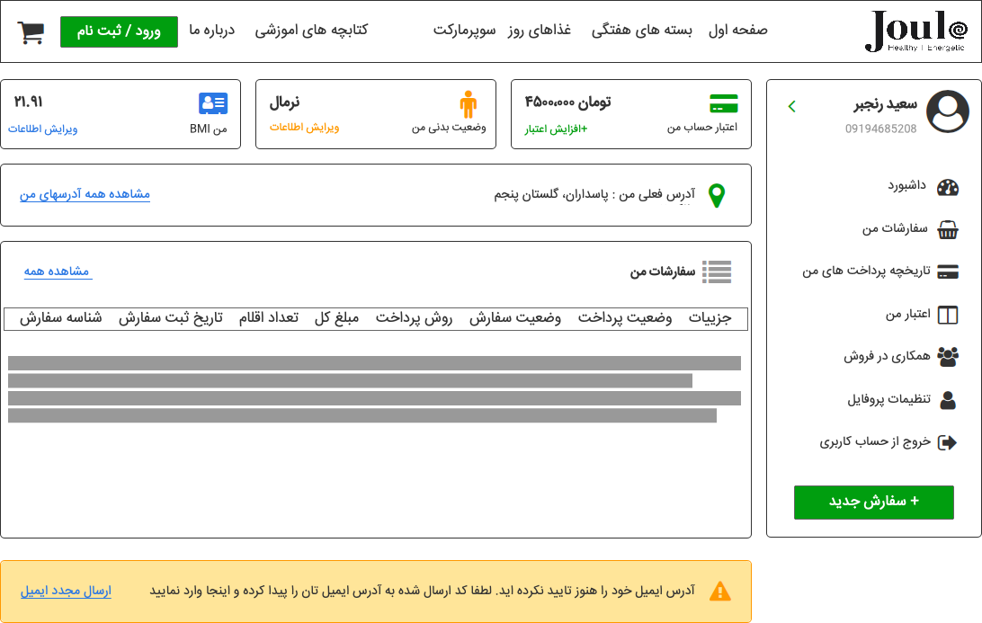
On the new registration flow, I removed the email confirmation step. And when a user wants to create an account without ordering a product, redirect to the profile page. but If the user wants to order a product not redirect to the profile filling step.
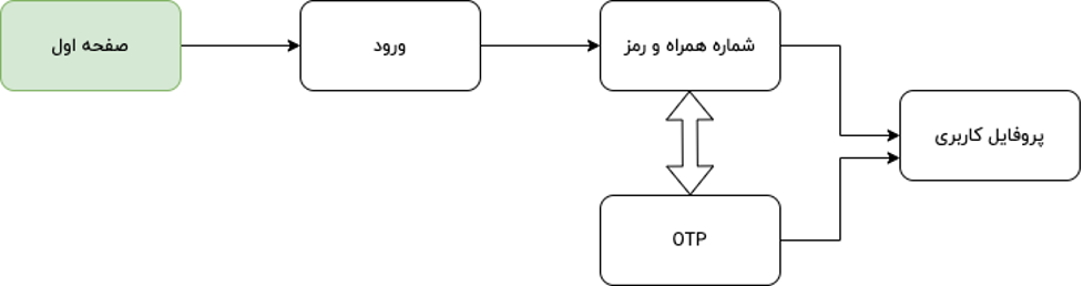
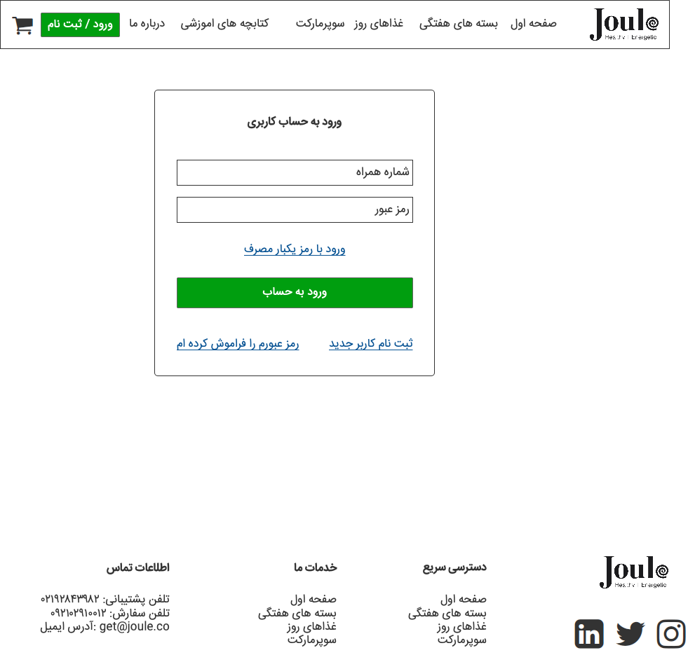
New Login flow.
On the new login flow, I add login with OTP and phone number to reduce login time and put the username/password mode as an option.
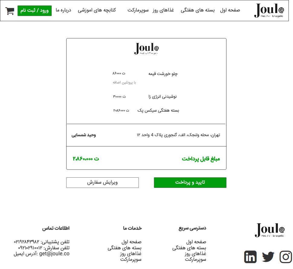
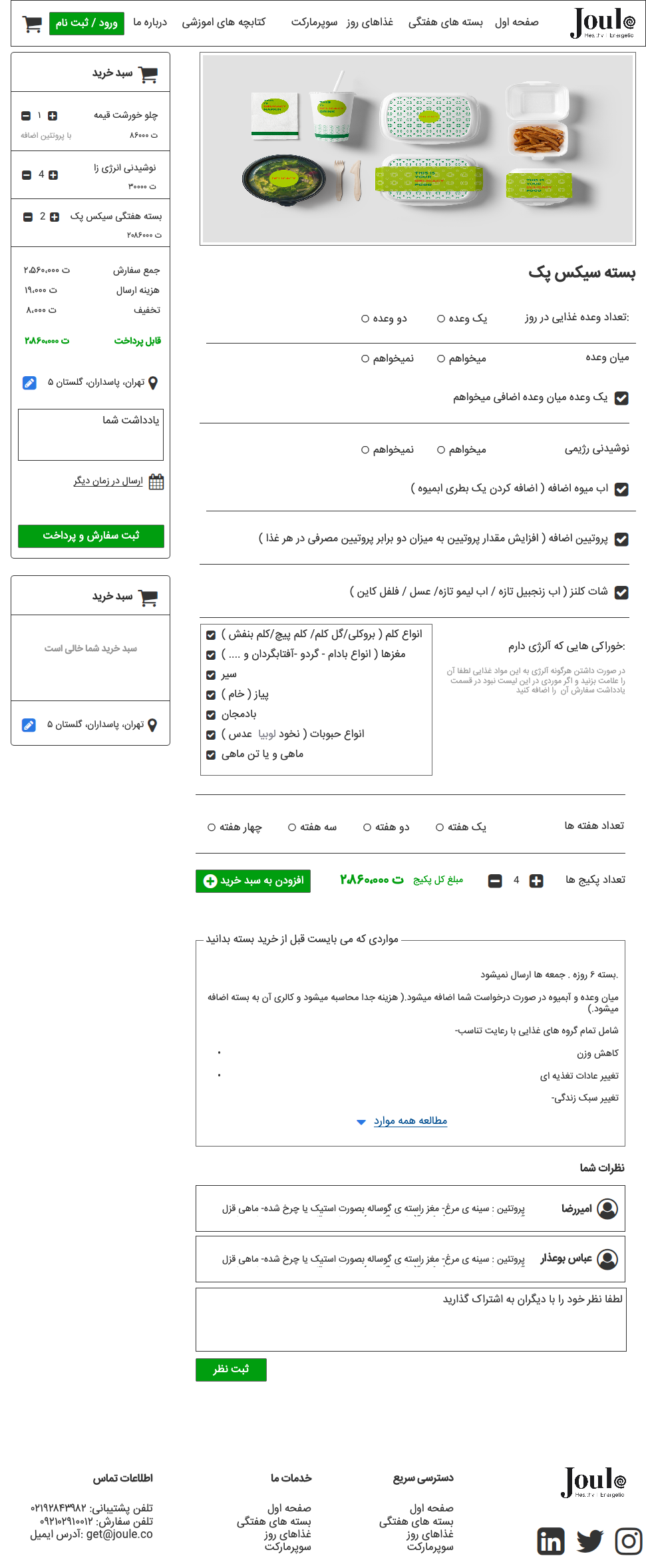
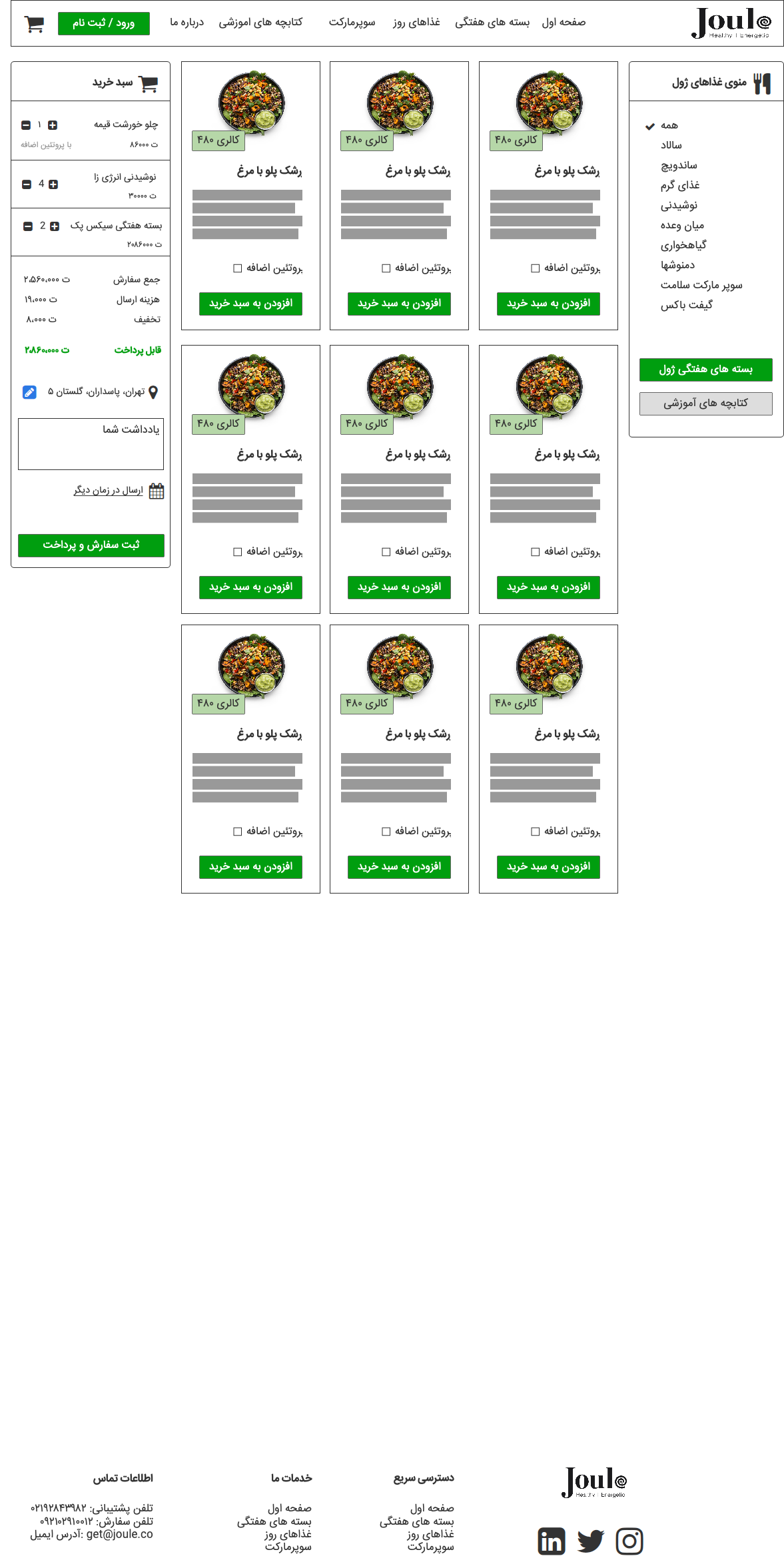
New Order flow.
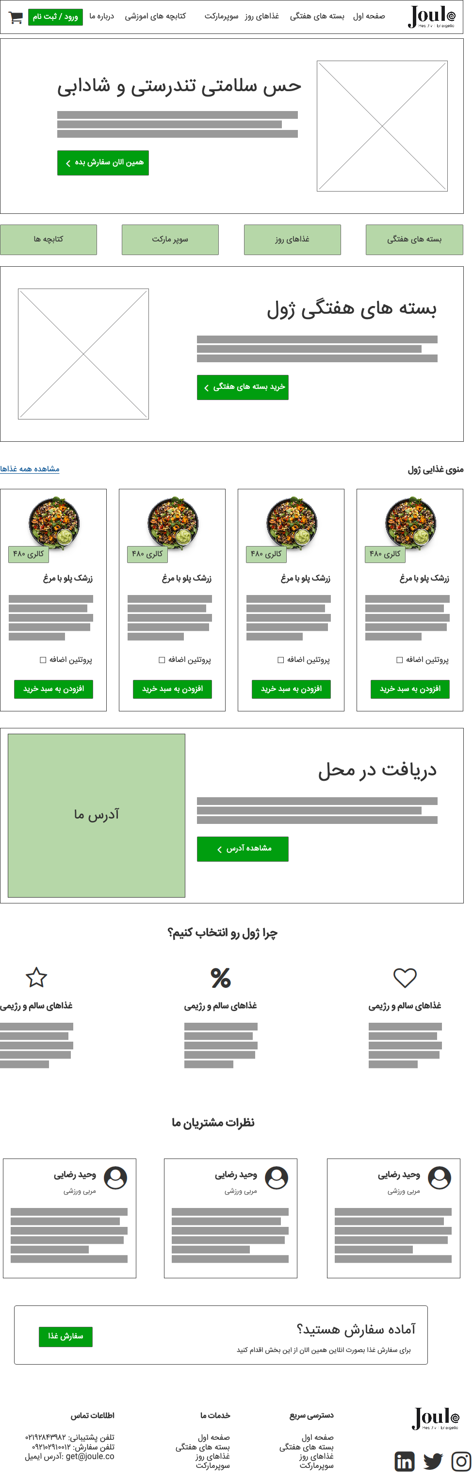
On the new order flow, I added products categories on the home page to inform the users that we have multiple types of products then added a basket.
On the yellow box, I added the address selection instead of putting the address every time.